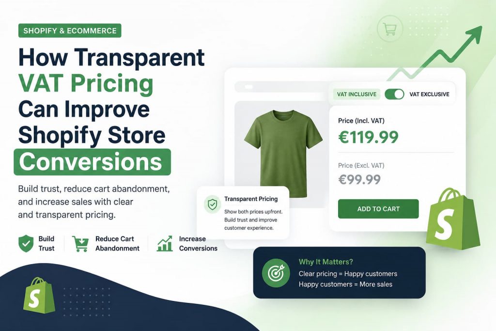
Try selling across a few countries and tax will trip you up sooner or later. A shopper in Berlin expects one total. A wholesaler two streets away expects another. Shopify will not sort that out on its own, and most merchants only find out the hard way, usually after a customer writes in asking why the price on the checkout page does not match what they saw on the product listing.
That mismatch costs real sales. People do not stick around to figure out where the extra charge came from. They just leave. This solves the problem by showing each visitor the price that actually applies to them.
Here is what tax display really involves for a store, why it trips up so many merchants, and what a proper setup looks like once you get it right.
Why Tax Display Causes So Much Trouble
VAT rules are not consistent from one country to the next. Some places charge a single flat rate on everything. Others split rates by category, so a paperback might sit at one rate while a dining table sits at another entirely. A store that sells across categories ends up juggling several numbers at once.
Buyers are not all the same either. A regular shopper wants one clean total with nothing hidden underneath. A business buyer wants the figure before tax, since they will claim it back later through their own books.
Show only one version and somebody always ends up annoyed. Retail customers hate a price that changes at the last step. Business customers hate doing arithmetic just to work out what they actually owe.
Where Shopify Does Well and Where It Falls Short
Shopify gets checkout math right almost every time, and merchants rarely have complaints there. The trouble starts earlier, on the product page and in the cart, where the platform gives you no native way to display two prices side by side.
Most store owners stumble onto this gap by accident, often right after a customer flags the jump between what they saw browsing and what they paid at the end. Patching it manually means touching theme code every single time a rate shifts, and that is not something most people want to keep doing.
Getting Your Head Around Dual Vat Pricing
What It Actually Looks Like on the Page
Dual Vat Pricing puts both numbers in front of the shopper at once. Usually the tax included figure sits up top in bold, and the excluding tax amount rests just underneath in a smaller font.
That small layout choice does a lot of heavy lifting. Nobody needs a calculator open in another tab, and nobody needs to email support asking what they will really pay. Both answers are already sitting on the screen.
Who Actually Needs This
Stores with a mixed customer base gain the most here. Picture a furniture shop selling to homeowners and to interior design firms under the same roof. One page layout now covers both crowds, no separate listings required.
How Shopify Handles VAT Pricing
Hand coding two prices onto each listing might work if you sell twenty products. It falls apart fast once your catalog hits the hundreds. This kind of tool takes over the whole job, pulling the right rate and putting both prices on the page without you ever opening a theme file.
Three parts usually carry the weight. A vat switcher lets a shopper flip between the taxed price and the tax free number, whichever suits them at that moment. A vat calculator sits quietly in the background, keeping every rate correct even after a country updates its tax rules. A clean display then holds both figures on screen without crowding the layout.
Turning the Toggle On
Setting up a vat app rarely takes more than a few minutes. Install the app, link it to your catalog, then pick a spot for the toggle. Most stores tuck it right beside the price tag, since that is where eyes land first anyway.
Once it is running, a returning shopper can switch views themselves, and their pick sticks around for their next visit too.
Making Sure the Math Holds Up
A vat calculator pulls the correct rate for every product and every region each time a page loads. This sounds minor until you remember that rates are not always uniform across a single country. Certain goods carry reduced rates, and one wrong number can turn into a real problem with a customer or with a tax office.
Keeping the Dual Vat Display Consistent Everywhere
A solid dual vat display does not overthink things. Keep the main price big and obvious, then tuck the second figure just below it in smaller type. Nobody should have to scroll or click around hunting for both numbers.
That same layout has to follow through the cart and all the way to checkout. If the product page led with the taxed total, the checkout screen needs to stick with that same framing. Flip the format halfway through the journey and you will lose people right there, cart still full.
A Short Setup Checklist
A few steps make this easier:
- Check your current Shopify tax settings and confirm your regions look right.
- Work out whether your buyers lean retail, business, or a genuine mix of both.
- Pick a tool that offers dual pricing along with a switcher.
- Set your default view around your main audience, then flip the switcher on for everyone else.
- Walk through a full purchase yourself, start to finish, and check that the price with tax and the price without tax line up the whole way through.
Vennzo covers this whole list without asking you to touch a single line of code, which saves real hours for anyone who would rather not go digging through theme files.
A Couple of Things to Watch For
One thing that trips people up is a product page showing one price while checkout shows a different total. It usually comes down to tax settings and app settings drifting out of sync somewhere along the way. Run through a full purchase after any pricing change, not only a glance at the product page.
Hiding the toggle in a spot nobody checks is another slip. If shoppers cannot spot it, they will never use it, and the whole reason for offering two views disappears. Put it somewhere obvious, close to the price itself.
It also pays to revisit your rates whenever tax law changes somewhere you sell. A decent setup pushes those updates across your whole catalog in one move, so you are not chasing down product after product by hand.
Wrapping This Up
Tax display should never feel like guesswork, not for you and not for the person about to buy from you. Show both the price with tax and the price without tax, hand the choice over to the shopper, and most of the confusion that pushes people away just disappears. A app takes care of the technical side, the rate lookups and the display logic, leaving you more time to actually run your store instead of babysitting tax formatting.
If your customer base mixes private shoppers with registered businesses, getting this set up properly is worth the afternoon it takes. It beats stitching something together by hand and hoping it holds.




More Stories
What Makes a Gojek Clone App Different from Other Multi-Service Apps?
How to Choose the Best SEO Company in USA for Your Business
Uber Clone Web Booking vs Mobile App Booking: Which Is Better?