
If you have a business website, you want your website to turn visitors into customers, subscribers, or leads, right? What many business owners don’t know is that for that to happen, you can’t rely on just looking good. Your website needs to speak to your best customers, feel natural and earn their trust.
High-converting web designs (3% conversion rate or more) aren’t entirely about flashy effects or overthinking trends. These websites focus on seven timeless principles that help them attract clicks, generate leads, and turn casual visitors into customers. It’s important to approach web design from a point of what real people need and expect from a website.
These web-design principles may seem simple on the surface, but they actually work. They help you make your offer message clear, guide people to the right places, and keep your pages functional. Once you nail these, you’ll notice visitors sticking around longer, clicking more, and actually buying or contacting your business.
Core Principles of High-Converting Web Design
Your website has an average of 3 seconds to grab user attention. People decide fast whether to stay or leave, so you need to give them something worth staying for. You can easily achieve this by making sure they can find what they need easily, understand what you offer, and feel like your site “gets” them and their problems.
The following are the guiding principles of high-converting designs that make websites convert above industry standard rates:
1. Clear Value Proposition
When someone lands on your website, they should instantly understand who you are, what you do and what’s in it for them. That’s your value proposition. Your hero section should answer the “why should I stay here?” doubt in your visitor’s mind.
It’s important to keep it simple and aim for a low reading level, such as 3rd grade. Don’t hide your message in buzzwords or long sentences, those end up alienating your audience and driving customers away.
Focus on benefits and the outcome, not technical details. For example, “Grow your social media presence on autopilot.” says a lot more than “Our platform supports social media scheduling.”
We recommend that you put that message right near the top of your page, at the hero section, where no one can miss it. Key design principles apply here too such as use of clean colors, bold/large text, and a quick headline that tells your story in one glance. When people understand your business immediately, they’re far more likely to keep scrolling and take action.
2. User-Friendly Navigation
Nothing makes visitors leave faster than getting lost on your website. It’s best practice to keep your navigation simple and predictable. Clarity beats creativity so avoid trying to be clever with labels. Our experts recommend using clear menu names like “Products,” “Pricing,” or “Services.”
Additionally, you want to group things logically. For instance, all support-related items should live under “Help.” And if your website has a lot of pages, add a search bar so people have shortcuts to your pages.
Before launching a website, test your navigation on mobile. Responsive menus that collapse neatly and feel easy to use lower frustration and keep users on your website longer. The goal of user friendly navigation is to give users a smooth experience that puts them in control, and place everything right where they expect.
3. Compelling Visual Hierarchy
High-converting web designs silently tell people what to look at first. This is achieved through visual hierarchy. You can use size, color, and spacing to guide the eye exactly where you want it to go and tell your visitors where their attention should be.
Simple principles for achieving high-converting visual hierarchy include; starting with a strong headline that catches attention. Break down long sections with subheadings or bullet points so people can skim easily.
Make your buttons and links stand out with sharp color contrast but keep the overall layout clean. Use white space to give you design breathing room. When your page feels easy on the eyes, visitors naturally focus on what matters most, your offer.
4. Mobile Responsiveness
If your website doesn’t work properly on mobile , you’ve already lost more than half your audience. Based on data from Tamati Digital, an analysis across over 80 websites found that an average of 64% of visits come from mobile, and mobile users scroll fast, skim faster, and won’t zoom in to read tiny text.
It’s important to check that everything, text, images, and buttons, fits naturally on smaller screens. Buttons should be large enough to tap without frustration, and content should flow smoothly from one section to the next. We recommend keeping paragraphs short for easy readability on mobile, since huge blocks of text can be overwhelming and a turn off for many people.
Google’s organic ranking algorithm also rewards mobile-friendly websites, so fixing this isn’t just good for users, it’s good for your SEO rankings. Try opening your website on a few different phones every so often in incognito tabs. Notice how it feels to use and if something feels awkward or slow, fix it right away.
5. Effective Use of Calls to Action
Your call to action (CTA) is where your high-converting design meets business. Your call to action is where you tell people, “Do this next.”
Keep CTAs simple and direct. “Get Started,” “Book a Call,” “Start Free Trial” — clear language beats clever every time. Additionally, use colors that pop but still fit your overall design, and place them where people naturally pause, such as, at the top, mid-scroll, and near the end of a section.
Don’t flood the page with buttons either, too many CTAs make users freeze up and do nothing. The best converting designs focus on one main action per page, and make sure every design element supports that goal.
6. Building Trust with Social Proof
People believe other people more than they believe what you say. So show them proof. Add reviews, testimonials, ratings, or even logos of companies you’ve worked with. All these signal that real humans already trust you.
We recommend using genuine, recent testimonials — nothing looks worse than fake or outdated ones. Photos, names, or even short video clips go a long way toward making your proof feel authentic and trustworthy.
In addition, small trust elements like security badges, verified payment logos, or a clear privacy policy link make your site quietly feel trustworthy.
7. Fast Load Times for Better Performance
Nobody wants to wait around for a slow website. According to Google, 60% of visitors click away if your website takes more than 5 seconds to load any content. Speed is invisible until it’s missing, and then it’s everything.
To easily achieve a fast loading website, compress your images, convert images to modern formats like .webp, remove bloated plugins, and trim unnecessary scripts. Tools like Google PageSpeed Insights can help you spot slowdowns fast.
Enhancing Conversions Through Strategic Design
Your website is more than just a digital storefront — it’s part of your sales team. When your website is easy to use and makes people feel understood, safe, and guided, conversions happen naturally.
The best businesses focus on what actually matters: clear messaging, smooth navigation, strong CTAs, and a sense of trust. Do those consistently and you’ll notice something: people won’t just visit your site. They’ll act, just like someone applying what they learned in a Digital Marketing Course.

More Stories
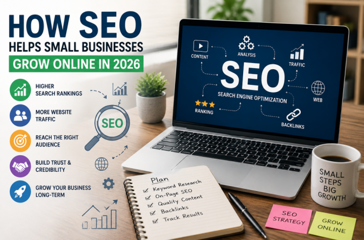
How SEO Helps Small Businesses Grow Online in 2026
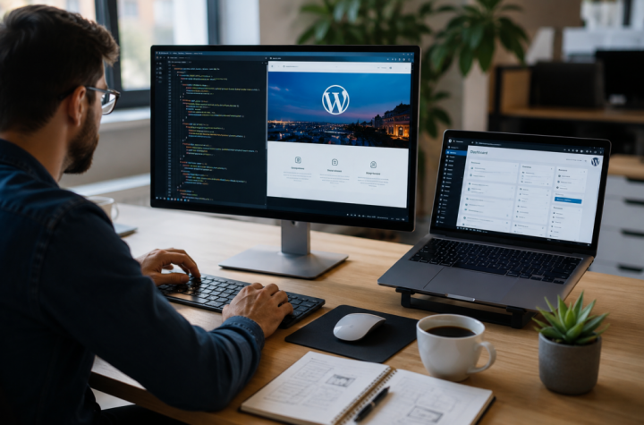
Custom WordPress Development: A Better Fit for Your Business
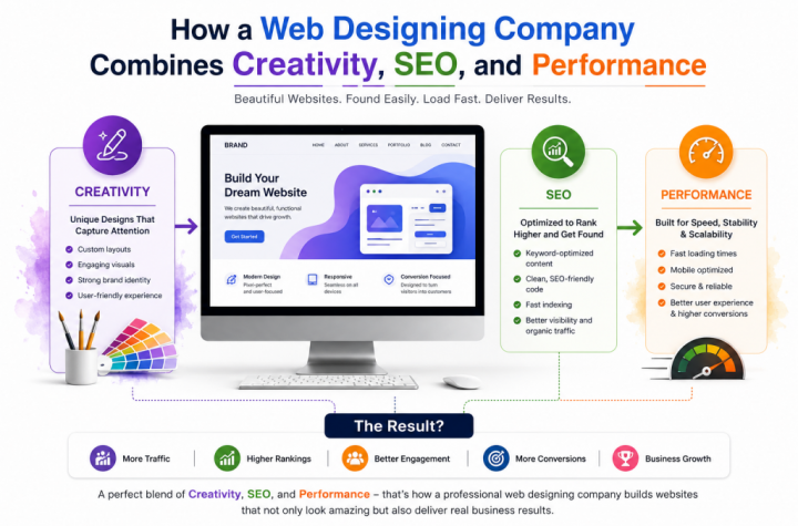
How a Web Designing Company Combines Creativity, SEO, and Performance