
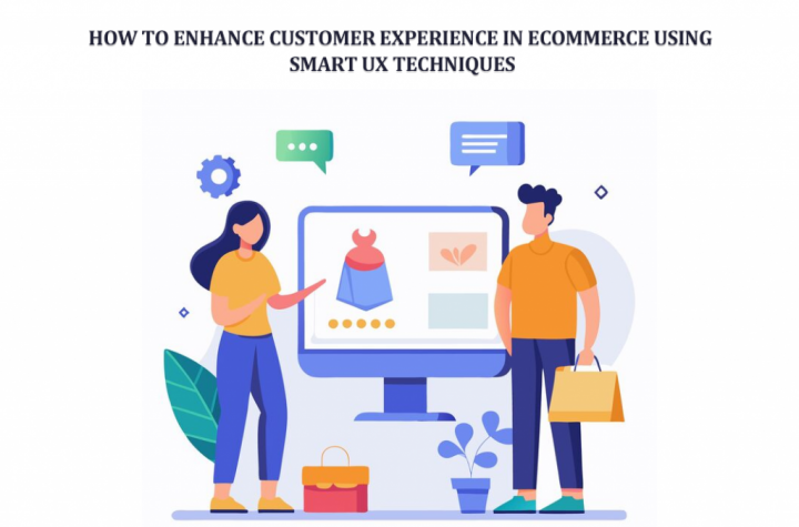
What really makes a customer stay on your online store and not leave within seconds? It is not just the product. Not even the price sometimes. It is the feeling. The ease. The way everything just flows without making them think too much.
Imagine this. A customer lands on your website after a long day. Maybe they are tired. Maybe just browsing. They click around. Things load fast. Buttons make sense. Products look clear. No confusion. No friction. They stay. They explore. They buy.
Now imagine the opposite. Slow pages. Weird navigation. Dropdowns that don’t work. They leave. Instantly. That is the power of UX. Subtle. Quiet. But it changes everything.
In eCommerce today, experience is the product as much as the product itself. And smart UX techniques are not just design tricks. They are business tools. Real ones.
Understanding the Importance of UX in eCommerce
User experience sounds technical. But it is actually very human. It is about how people feel while using your store. Simple as that.
Think about walking into a physical shop. If things are messy, you feel lost. If everything is arranged nicely, you feel relaxed. Same idea here. Just digital. Good UX does a few important things:
• It builds trust without saying a word
• It reduces confusion
• It helps customers decide faster
• It makes buying feel easy
Bad UX does the opposite.
• People hesitate
• They get frustrated
• They abandon carts
• They rarely come back
There is a small story here. A store owner once improved just their product layout. Nothing else. Sales went up. Not double. But noticeable. Why. Because people could finally understand what they were buying. That is UX. Quiet impact. Big results.
Key Smart UX Techniques to Enhance Customer Experience
1. Simplify Navigation and Structure
A customer should never feel lost. Not even for a second. Imagine someone entering your site. They are looking for shoes. If they have to click five times just to find sneakers, you have already lost them. Keep it simple:
• Clear categories
• Logical structure
• Search that actually works
Sometimes less is more. Too many options confuse people. There is also something interesting. When navigation feels easy, customers feel smarter. And when they feel smart, they stay longer.
2. Optimize Product Pages for Clarity
This is where decisions happen. Product pages are not just pages. They are selling spaces. A good product page tells a story. Not just specs.
- • What is this product
- • Why does it matter
- • How will it help me
- Images matter a lot. People don’t read everything. They scan. They judge fast. Add:
- • Multiple images
- • Real-life views
- • Clear descriptions
And here is the thing. If a customer has even one doubt, they pause. And pause often means no purchase. So, remove doubt. Before it even appears.
3. Use Visual Variation Selection
Let’s be honest. Dropdowns are boring. And sometimes confusing. A customer wants to pick a color. Why make them open a list? Why not show the colors directly? Visual selection feels natural.
• Click a color
• See the change instantly
• Feel confident
There was a small clothing store that switched from dropdowns to color swatches—a simple change. But customers started interacting more. They clicked more. They explored more options because it felt real. Not mechanical.
4. Improve Mobile Responsiveness
Most people are on their phones. Not laptops. That’s reality now. So, your store must feel right on a small screen. Not squeezed. Not broken. Think about:
• Thumb-friendly buttons
• Fast loading
• Clean layout
If a customer has to zoom in or struggle to tap something, they won’t try again. They just leave. Mobile UX is not a feature anymore. It is the default.
5. Enable Quick View and AJAX Features
People don’t like waiting. Even a second feels long sometimes. Quick view is powerful. It lets users peek into a product without leaving the page. AJAX features make things smoother:
• Add to cart without reload
• Update instantly
• Keep browsing
It feels modern. Almost effortless. There was a user once who said they didn’t even realize they added three products to the cart. It felt that smooth. That’s what you want.
6. Personalize the Shopping Experience
Not every customer is the same. So why show everyone the same thing? Personalization changes the game.
• Show what they like
• Recommend what fits
• Remember their behavior
It feels like the store understands them. A returning customer sees products similar to what they viewed before. They don’t need to search again. They feel recognized. And people like that feeling.
7. Speed Optimization is Non-Negotiable
Speed is silent. But powerful. A slow site kills interest. Fast. Even a delay of two seconds can change behavior. Customers get impatient. They click away. Improve speed with:
• Optimized images
• Clean code
• Proper hosting
Think of speed as respect for the customer’s time.
8. Enhance Checkout Experience
This is the final step. And often the most fragile one. Everything can go right. And still fail here. Complicated checkout feels like work. People don’t want to work. Keep it simple:
• Fewer fields
• Clear steps
• Easy payments
Also, transparency matters. Hidden costs create frustration. A customer once reached checkout. Saw extra charges. Left instantly. That sale was gone, just like that.
9. Use Smart Variation Display Techniques
This is where things get interesting. And practical. Product variations are often hidden inside dropdowns. Customers don’t always explore them. They miss options.
Now imagine showing each variation clearly. Like separate choices. Easy to see. Easy to pick. That’s where Smart Variation Options WooCommerce becomes useful. It improves how WooCommerce variations are displayed, making them more visible and interactive. Customers don’t have to guess anymore. They see everything up front.
• Colors
• Sizes
• Styles
All clear. All clickable. This reduces confusion. And increases engagement.
10. Build Trust with Social Proof
People trust people. Not brands. Not always. Reviews matter a lot. When someone sees others buying and sharing feedback, they feel safer. Add
• Customer reviews
• Ratings
• Real photos
It builds confidence. Quietly. There is a simple pattern. No reviews mean hesitation. Good reviews mean action.
Advanced UX Strategies for Competitive Advantage
1. Interactive Product Galleries
Static images are okay. But interactive ones are better. Let users explore:
• Zoom
• Rotate
• View details
It feels closer to real shopping. Some stores even show different images for each variation. That adds depth. Customers understand the product better. And when they understand, they buy.
2. AI-Powered Search and Recommendations
Search can be smart now. Not just basic. AI helps customers find things faster. Even if they type something vague.
• Suggest products
• Predict intent
• Improve results
It reduces effort.
And effort is something customers avoid.
3. Consistent Branding and Design
Consistency feels professional. But also comforting. When everything looks aligned, customers feel they are in the right place.
• Same colors
• Same style
• Same tone
It builds identity. Even small inconsistencies can feel off. And people notice even if they don’t say it.
4. Accessibility and Inclusivity
Not everyone uses a website the same way. Some people need larger text. Some use keyboards. Some rely on screen readers. Good UX includes everyone.
• Clear fonts
• Alt text
• Easy navigation
It is not just about compliance. It is about care.
Common UX Mistakes to Avoid
Mistakes happen. But some are costly. Here are a few
• Too much information on one page
• Confusing menus
• Slow loading pages
• Poor mobile design
• Hidden fees
Each one creates friction. There was a store that had great products. But cluttered pages. Customers felt overwhelmed. Sales dropped. They simplified things. Sales improved. Sometimes fixing UX is not about adding more. It is about removing what is unnecessary.
Conclusion
Customer experience in eCommerce is not one big thing. It is many small things working together. Quietly. A fast page here. A clear button there. A helpful recommendation at the right moment. It all adds up.
Smart UX techniques are not just design choices. They are business decisions. They affect how customers feel. And feelings drive actions. When a store feels easy, customers stay. When it feels right, they trust. And when they trust, they buy.
The goal is simple. Remove friction. Add clarity. Create flow. Because in the end, customers may forget what you sold. But they remember how it felt to buy from you.


More Stories
Why Businesses Choose a Professional SEO Agency in Mangalore
Is SEO Dead or Evolving in 2026?
SEO Tools Comparison: Which Ones Actually Deliver Results