
Content marketing is all about creating a long lasting impression on your target audience. Visual content does it like nobody else. It’s the king of the content marketing world.
The reason behind that is quite simple though. Human brain processes visual matter faster than that of simple text. Naturally, the demand of visual information grows significantly in comparison to that of plain text. Thus, you can also very well see how infographics come in at this point.
Infographics are almost based completely on visual information with a little bit of illustrative text thrown here and there to explain the visual content in greater detail. A unique and detailed infographic is one of the best things that you can ever have in your digital marketing arsenal because it is one of the most shared thing on social media platforms.
In here, our experienced Greenville web designers have discussed a few ways through which you can create a killer educational infographic that can benefit both teachers and students at the same time (yours as well especially when digital marketing is concerned). Let’s begin.
1. Data processing needs to be done as minutely as possible
You might gather all data yourself or somebody else can create it for you but the point is, you need to do such data mining as minutely as possible. This is an educational infographic so correct and relevant information is considered an absolute must.
Source your data ONLY from credible sources. Record the website links so that you can provide them in a references column in your infographic. That will make your infographic more credible.
My suggestion to you at the time of browsing/researching is to read the matter thoroughly. Don’t just skim over the entire thing. Significant nuggets of information can hide anywhere. Make sure you don’t miss any.
Be organized in your approach. Record relevant and important data that you have plans to use in your infographic sequentially in a separate word document.
2. For a well-ordered approach, creating a wireframe is advisable
A wireframe is just a skeleton of the thing that you’re working with. It’s considered a staple part of any design especially when it involves a whole of complex designs and information.
You should consider making a wireframe of your entire infographic at the start to save you a lot of headache. Just a rough sketch on a piece of paper would suffice.
3. Be a little creative with your infographic format
You’ll notice certain nuggets of information in your infographic that can be represented in an out-of-the-ordinary way. Don’t hesitate to try that out.
Use charts, flow charts, diagrams etc. to give your infographic that zing that most students/teachers look for in educational infographics. Be a little creative with it. A bland infographic won’t suit your purpose well.
4. Set your infographic tone
The voice of your infographic must match that of your subject content.
If the subject matter is serious, the design should be based on something resembling that. If it’s light-hearted, be like that. The idea is pretty simple. Follow it.
5. Your infographic should be like something that’s telling a story
The story of your infographic should be structured at the time of your wireframe designs. Nobody likes a mundane and boring source of information. Your information nuggets should be interacting and engaging at the same time.
Is your infographic telling a story or is it just presenting users with a bunch of facts? Ensure that it’s the former, not the latter.
6. Don’t just stick to a flat design
Flat designs occur when there’s no z-axis depth in your design visuals. Sometimes, they are used intentionally by designers but most people find non-flat designs to be more appealing.
The more aesthetically appealing your infographic is, the more engaging it becomes. And the more engaged your audience is, the higher they spend time extracting value from your graphic.
An easy way of avoiding the flat design is to incorporate the shadow effect. This can be easily done by toggling the drop shadow effect on Photoshop and doing some experimentation around it.
7. Pay special attention to the alignment
Use alignment in your graphics and text to add symmetry as well as order to your infographic design.
Alignment is a concept used in design that organizes all elements along the center or the edges to project an uncluttered, clean visual effect.
If you are taking a minimalistic approach to your infographic design, pay special attention to the alignment because it is going to be the backbone of that design.
8. Try to mix it up
When you are exhibiting multiple sets of data on your infographic, mix up different types of data visualizations.
Meaning, do not just use the same type of chart or graph. This will play a massive role in keeping your infographic fresh, thus, engaging the audience.
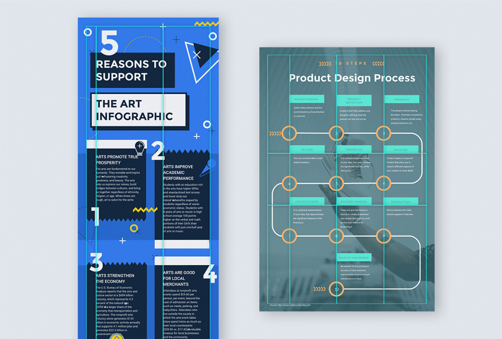
You can also try experimenting with color or size to create some sort of differentiation in the graphical elements. Here’s an example for your reference.
9. Last but not the least, think outside the box
If you want to create something unique, you have to think outside the box. You have to step out of the herd. Don’t hesitate to use new ideas if you have any. You will be benefitted tremendously if you can implement a few extraordinary ideas in your infographic.
A few thumb rules…
- Your infographic typography should be consistent and it should complement the visual matter.
- Overcrowding is a big no-no.
- Consider using only those colors in your infographic that work well on device screens.
- Proofreading is an absolute must.
- Always make sure that there is ample space left at the bottom of the infographic to link to your data sources. Also, do not forget to showcase your company brand and other contact information on the infographic footer.
So that is it then. We hope you find these tips handy enough in your upcoming design endeavor. Good luck!


More Stories
How to Choose the Right Niche for Your Online Business
5 Ways to Boost Your Business with Online Marketing
Latest Trends in Digital Marketing for the Fashion Industry